The PAX App: Explore Pods

In early 2021, I led the end-to-end design of Explore Pods, a guided, data-driven strain discovery feature in the PAX mobile and web apps. Over two phased releases, we achieved a 42% adoption rate—4,200 of our ~10,000 monthly active users—in the first six weeks, boosted average session duration to 6 minutes, increased pre-purchase intent by 13%, while lifting our Android app rating from 3.9★ to 4.2★.
Role
Design Lead
Tools
Sketch, Color Contrast Analyzer
Platform
The PAX App on Android and Web
Client
PAX
Year
2021
Team
2 Designers, 1 Researcher, 3 Engineers
Overview
Explore Pods simplifies cannabis strain discovery by surfacing lab-verified data, personalized guidance, and smart filters in a clean, education-first UI. This strategic feature aimed to own the pre-purchase moment, drive pod sales, and reinforce PAX’s authority beyond hardware.
The Problem
Users described strain discovery as “confusing, inconsistent, and high-risk.” From a mixed-methods study (N = 1,718), we identified five core pain points:
High cost of trial-and-error.
“I hate spending $40 on a pod that doesn’t feel right,” one user lamented.Overwhelming choice.
Unreliable strain information.
“Terms like indica/sativa leave me guessing,” said a frequent buyer.Low confidence in dispensary staff.
“I feel judged asking questions,” reported a novice user.Lack of transparency or education.
This friction led 62% of users to abandon purchases, eroding trust and conversion.
Discovery & Research
We employed a four-pronged approach:
Quantitative survey (10-minute Qualtrics, N=1,718)
Qualitative interviews with novice and power users
Competitive audit (Leafly, Weedmaps, Reddit, YouTube, in-store UX)
Analytics review of drop-off points
Key Insights:
62% abandoned brick-and-mortar or digital carts due to uncertainty.
Outdated taxonomy (indica/sativa) confused most users.
Clear, plain-language effects (“relaxed,” “creative,” “sleep”) resonated.
Trust soared when lab results were visible.
Personas:
Novice Nora (24 y/o, first-time buyer): fears trial costs, seeks simple guidance.
Connoisseur Carl (35 y/o, experienced): demands lab data and nuanced effect details.
Goals
Intuitive, personalized strain discovery.
Build credibility with lab-verified data.
Encourage repeat engagement & boost sales.
Capture first-party insights for future personalization.

Quiz-Based Onboarding
Conversational prompts (“What do you want to feel?”).
Alternating chips and sliders to maintain engagement.
“Why this pod?” micro-interactions explain logic.
💡 Why it worked:
Anchored discovery in a known, real-time context
Used metadata (potency/flavor/effect) to guide lateral exploration
Made re-purchase or upgrade intuitive and low-friction
Manual Browsing & Filtering
Persistent, sticky filter bar: effect, THC %, flavor.
Real-time count indicators and applied-filters badges.

💡 Why it worked:
Created an approachable onboarding entry point
Adjusted tone and logic based on usage level
Provided “Why this pod?” rationale to build trust

UX Craft in Detail
As Design Manager on Explore Pods, I developed the core design principles and visual identity framework that guided our team’s craft, consistency, and quality from kickoff through launch.
💡 Why it worked:
Filters prioritized effects, THC %, strain type, flavor
Comprehensive without overwhelming users with information above the fold.
For the user who knows nothing, subtly enducates them on how they can think about searching for what they want (by feeling, by strain type).

💡 Why it worked:
Used conversational language ("What do you want to feel?")
Uses approachable language and concepts to help users better understand what they are looking for.
Introduced an explainer for “Why this pod?” to enhance transparency


Versioning & Handoff
All tokens, motion specs, and component variants live in our shared Figma library (v1.0). We held weekly engineering syncs to ensure consistency and eliminate extraneous values in code.


Visual Identity
At this stage, as we sought to honor PAX’s hardware roots while tentatively expanding into software, we adopted a restrained visual identity—generous white space, strategic black anchors, and purposeful accent hues—to maintain a clean, premium, and intuitively navigable UI; later, we recognized the need for a more expressive style to fully support our digital evolution.
Build from White (“Purity”)
Generous white space keeps focus on essentials—no unnecessary UI.Black for Core Moments (“Premium”)
Reserved for headers, primary CTAs, and anchor points to signal importance.Color for Way-finding (“Emotion + Info”)
Color use is restrained and intentional.
Design System Tokens
These tokens define our core brand blacks and whites, secondary greys, and accent indicators—ensuring every UI element uses color with clear purpose and consistency.

Accessibility Validation
Contrast Audits: axe-core and Color Contrast Analyzer confirm all color pairs pass WCAG AA.
ARIA Labels: e.g.,
<div aria-label="Effect: Relaxed, selected by 68% of users">.
Design Iterations
Design Strategy
We treated Explore Pods as a modular UX system, not a one-off feature, ensuring consistency across mobile, web, and desktop:
WCAG AA-compliant color, typography, and interaction patterns.
Responsive component library tokenized for color, spacing, and typography.
Regulatory constraints: standardized lab-data import across six state formats.
Performance: skeleton loaders and lazy-loaded images to mask data latency.
Final Experience Flows and Screens
Device-Aware Discovery
Auto-detects user’s PAX device model, surfaces compatible pods.
Contextual “Recommended for your device” banner anchors exploration.
Strain Effects Iterations
Early prototypes used a single calm → energizing slider to represent each strain’s effects. Although the slider looked sleek, usability testing revealed it was confusing—participants weren’t sure what “calm” versus “energizing” measured and often skipped it altogether, undermining confidence in our data.
We replaced the slider with a discrete top-3 effects model: three clearly labeled chips (e.g. Relaxed, Creative, Focused) alongside lab-verified percentages (e.g. “62 % of users felt calm”).
By simplifying the visual language around effects and grounding each label in real user data, the interface became more honest, approachable, and genuinely useful—especially for newcomers exploring cannabis for the first time.
Strain Details Page Iterations
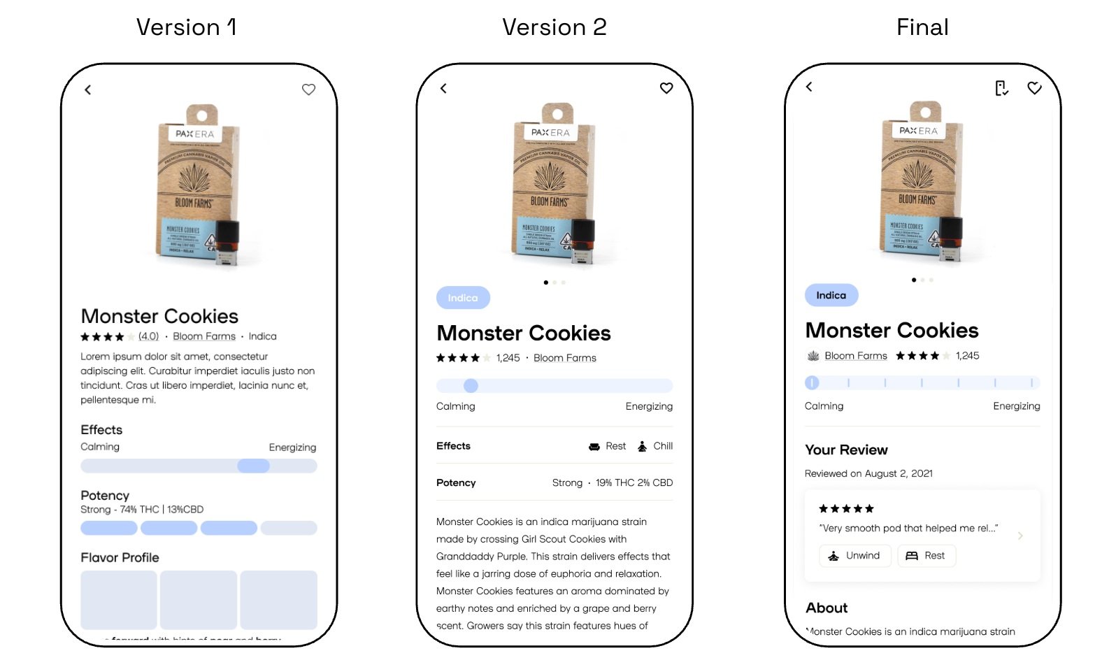
Version 1: Information feels dense at the top of the page. Visual hierarchy is flat between sections. Reviews should show # of reviewers. Effects slider is helpful but not very granular.
Version 2: Introduced an “Indica” badge, segmented ticks on the slider, icon-based effects row with specific effects, and moved descriptive text down—context improved but the page still felt cluttered.
Final: Complemented the slider with three clear effect chips + user-verified percentages. Well balanced visually. Information density is good (comprehensive but not overwhelming).
Results:
30% faster page scanning
User feedback: Clean, honest, scannable.
Release and Outcomes
Release Phases:
Phase 1 (MVP): Ratings, reviews, strain pages, Certificates of Analysis.
Phase 2 (Full): Quiz flow, Pods home/search, Brand Partner data.
Measurable Results:
42% adoption (4,200/10,000 MAUs) in initial six weeks
4.2★ Play Store rating (↑0.3★)
6 min avg. session duration

Certificate of Analysis
Responded to black market product quality crisis, with first of its kind experience—providing verified and transparent third party pod test reports to users.
Within two weeks of launch, 68 % of users tapped the COA panel at least once, and App Store reviews mentioning “test reports” increased dramatically.

💡 Why it worked:
Converted third party lab report PDFs so users could Identify their pod and view test results with batch-level accuracy.
Collapsing detailed COA data into expandable sections kept the screen clean while empowering users to dive deeper