Google: Search Mobile OSRP
UI refresh and color system design for color extraction in Organized Search Page Result (OSRP) mastheads. Color extracts from images relating to search results and snaps to a systematized palette with predetermined values for various elements of the UI. Our team’s goal was to modernize the product and create a system that is visually appealing while maintaining product performance and accessibility.
Role
Visual Designer
Tools
Sketch, Color Contrast Analyzer
Platform
Google Search
Client
Google
Year
2019
Team
3 Designers, 2 Researcher, 4 Engineers
Overview
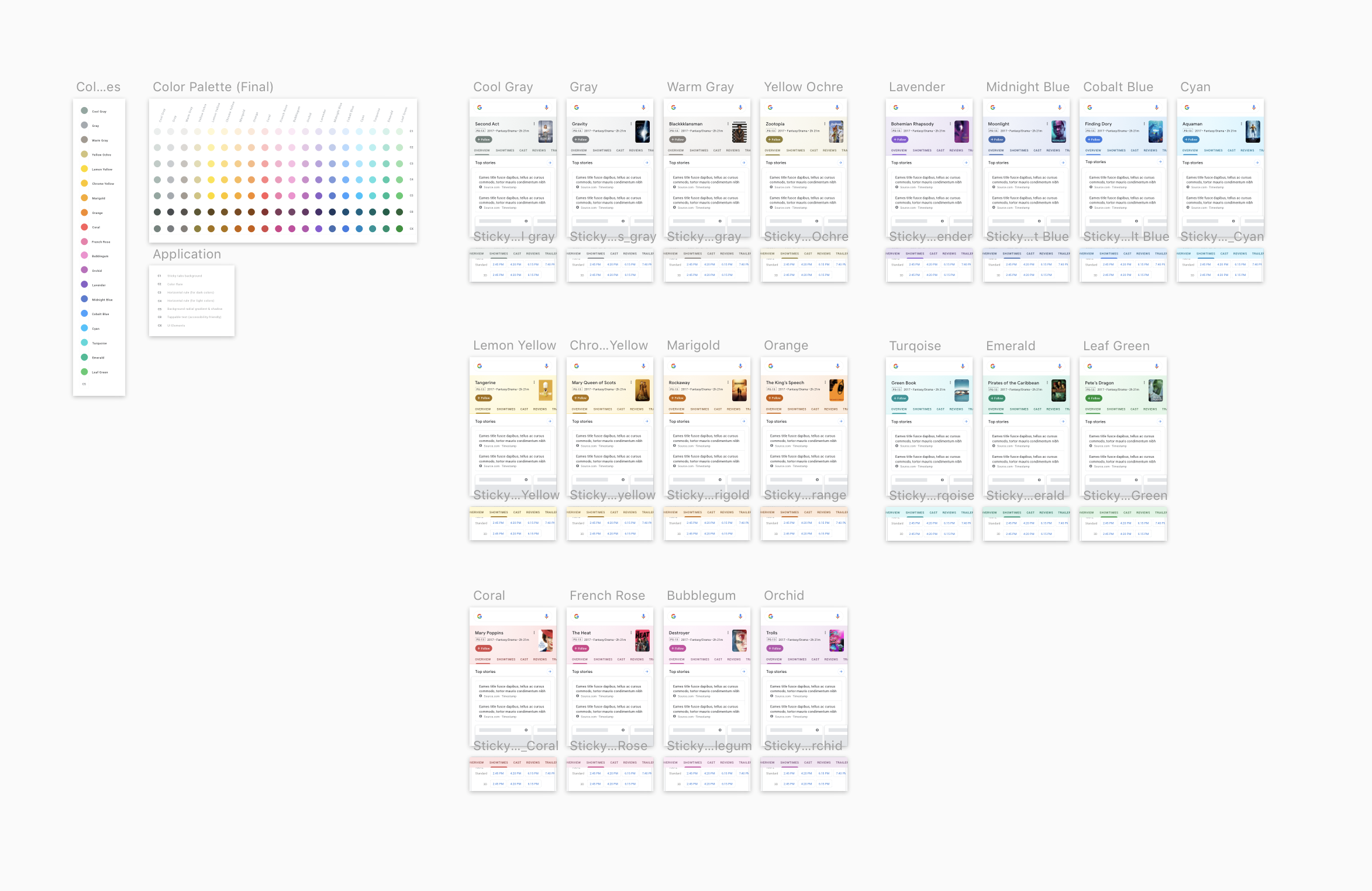
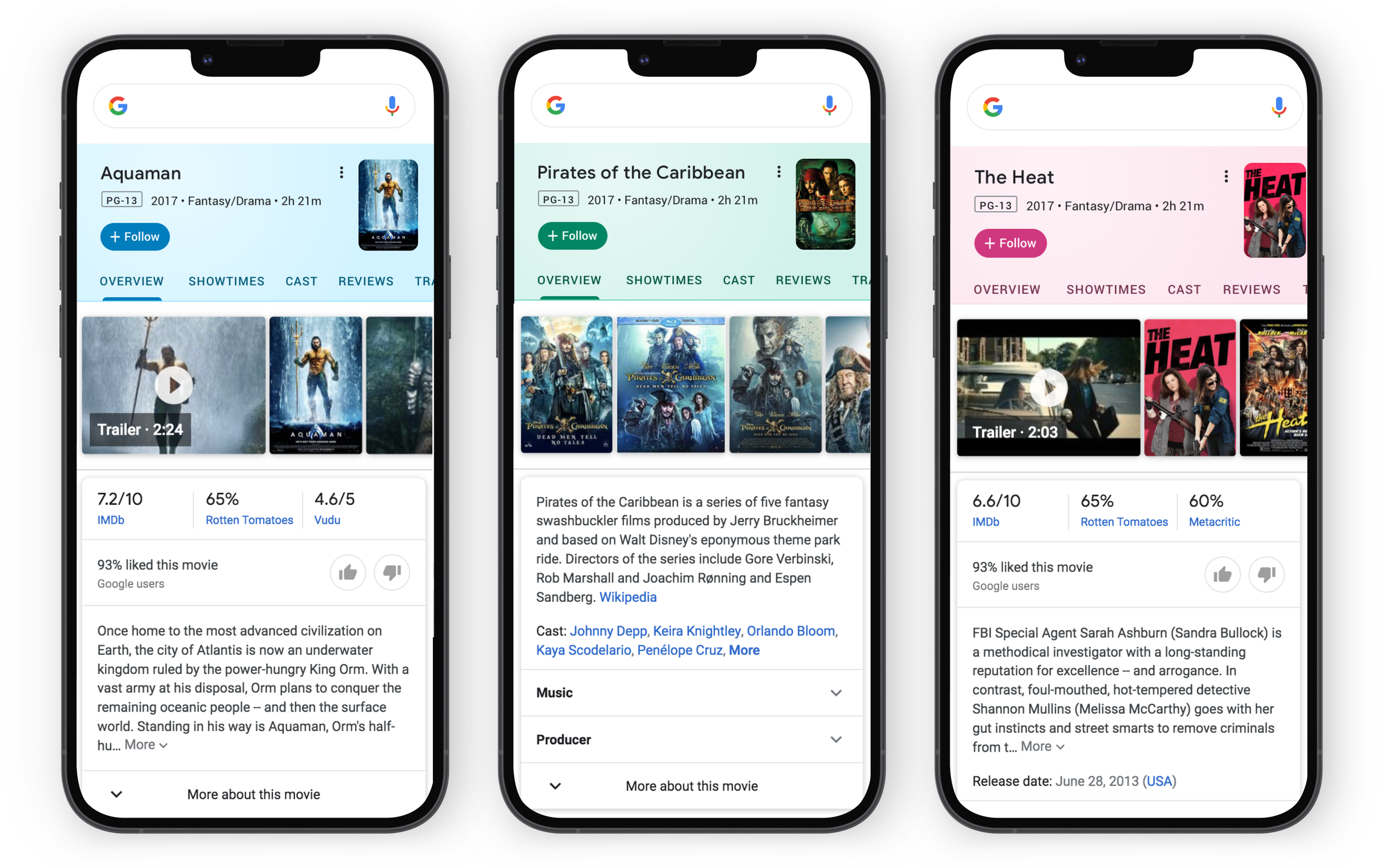
A dynamic color-extraction system for Google Search’s OSRP mastheads, enabling UI palette adaptation to third-party imagery. Utilizing a radial-snapping algorithm, we extract dominant hues from masthead assets and map them to a disciplined token scale (C1–C8, CX), ensuring consistent application across dividers, backgrounds, tabs, and CTAs.
The system supports over 20 distinct hue inputs, and upholds 100% WCAG AA compliance on follow buttons, active tabs, and links. Validated through hill-climbing A/B experiments over 10 million daily queries—each variant held within a ±1% click-through regression guardrail—the chosen CX-row configuration achieved a +0.2% engagement lift.
The Challenge
Monolithic Brand Blue: Years of performance tuning had locked every tab, button, and divider into a single dark-blue, ignoring context.
Visual Dissonance: Rich third-party imagery felt disconnected from the static UI, eroding perceived polish.
High Stakes: Any tweak risked measurable click-through regressions beyond our ±1 % threshold.
Accessibility Mandate: Must meet WCAG AA/AAA for Follow buttons, active tabs, and tappable text across 20 extracted hues.
Accessibilty Audit
Audited 21 extracted hues × 5 UI elements in an automated contrast matrix—identifying ~40% of combinations failing AA.
Key Insights:
Accessibility Gaps: One-third of raw hues failed AA on interactive tabs, as surfaced by our audit and a post-launch bug report.
Solution:
CX Row: A custom CX row of eight optimized hues met AA/AAA, felt on-brand warm, and became our standard palette.
Hillclimbing for Perfomance
Designed and ran four hill-climbing experiments over two weeks, testing contrast boosts, gradient intensity, and tab styles across 10 million daily queries—measuring click-through deltas against our ±1 % guardrail.
Key Insights:
Contrast vs. Clarity: A +20 % contrast arm yielded a +0.3 % engagement lift (well within tolerance) but introduced a “muddied” look flagged by observers.

Goals & Success Metrics
Harmonize UI with any masthead imagery
Maintain click-through within ±1 % (target: 0 %)
Achieve 100 % WCAG AA on interactive elements
Ship a reusable, documented token library

Final Specs
Building on these findings, I documented:
Radial-Snapping Documentation
Fetch masthead asset → extract dominant hue → snap to nearest token (C1–C8 or CX) → apply via CSS/Android/iOS variable.
Token Mapping & Usage
C3: Hairlines & dividers
C5: Background gradients
CX: Interactive elements (tabs, Follow CTA)
C8: Tappable text links
Impact
Within three weeks of rollout:
80 % Adoption of dynamic palettes across global OSRP mastheads
100 % WCAG AA coverage on key interactive elements (up from 68 %)
+0.2 % Click-Through Lift on the chosen CX-row variant
Qualitative Feedback:
“This dynamic palette feels remarkably on-brand yet fresh,” — VisD lead.


System Overview
Audited 20 extracted hues × 5 UI elements in an automated contrast matrix—identifying ~40% of combinations failing AA.
Key Insights:
Accessibility Gaps: One-third of raw hues failed AA on interactive tabs, as surfaced by our audit and a post-launch bug report.
CX Row: A custom CX row of eight optimized hues met AA/AAA, felt on-brand warm, and became our standard palette.