Sounding Board Leadership Development Platform
Sounding Board is a comprehensive, B2B leadership-development platform that combines high-touch coaching with data-driven insights to help organizations scale leadership skills at enterprise scale. Through personalized 1:1 coaching, group labs, and on-demand learning modules, it guides coachees from discovery and goal-setting through reflection, while empowering coaches with streamlined session tools. Administrators can spin up cohorts in minutes using an AI-powered Setup Assistant, and stakeholders access real-time dashboards that surface engagement metrics, capability growth, and ROI—ensuring every level of the organization has the clarity and control needed to drive measurable impact.
Role
Design Lead
Tools
Figma, Color Contrast Analyzer
Platform
The PAX App on Android and Web
Client
Sounding Board
Year
2023-2024
Team
1 Designers, 1 PM, 3 Engineers
Overview
Coachees were lost in a sea of coach profiles; coaches spent 15+ minutes per session just to schedule; admins wrestled with spreadsheets; L&D leaders lacked ROI visibility. Disparate manual processes led to single-digit booking rates and stalled adoption.
Through platform-wide design/ UX improvements and 0-1 feature launches, we enabled a 40% increase in monthly coaching bookings, creating a B2B platform adopted by 12+ enterprise clients—Zoom, Chime, Bill, Luma, Plaid, Credit Sesame, Code for America, Axis, Logixboard, Intervenn, Cohesity, and UserTesting. As Lead Product Designer (Q3–Q4 2023), I conceptualized and shipped the AI-Matching widget and the Cohort-Setup wizard, partnering with Data Science, Engineering, and L&D SMEs.
UX Craft in Detail
As Design Manager on Explore Pods, I developed the core design principles and visual identity framework that guided our team’s craft, consistency, and quality from kickoff through launch.


Versioning & Handoff
All tokens, motion specs, and component variants live in our shared Figma library (v1.0). We held weekly engineering syncs to ensure consistency and eliminate extraneous values in code.


Visual Identity
At this stage, as we sought to honor PAX’s hardware roots while tentatively expanding into software, we adopted a restrained visual identity—generous white space, strategic black anchors, and purposeful accent hues—to maintain a clean, premium, and intuitively navigable UI; later, we recognized the need for a more expressive style to fully support our digital evolution.
Build from White (“Purity”)
Generous white space keeps focus on essentials—no unnecessary UI.Black for Core Moments (“Premium”)
Reserved for headers, primary CTAs, and anchor points to signal importance.Color for Way-finding (“Emotion + Info”)
Color use is restrained and intentional.
Design System Tokens
These tokens define our core brand blacks and whites, secondary greys, and accent indicators—ensuring every UI element uses color with clear purpose and consistency.

Accessibility Validation
Contrast Audits: axe-core and Color Contrast Analyzer confirm all color pairs pass WCAG AA.
ARIA Labels: e.g.,
<div aria-label="Effect: Relaxed, selected by 68% of users">.
Design Iterations
Strain Effects Iterations
Early prototypes used a single calm → energizing slider to represent each strain’s effects. Although the slider looked sleek, usability testing revealed it was confusing—participants weren’t sure what “calm” versus “energizing” measured and often skipped it altogether, undermining confidence in our data.
We replaced the slider with a discrete top-3 effects model: three clearly labeled chips (e.g. Relaxed, Creative, Focused) alongside lab-verified percentages (e.g. “62 % of users felt calm”).
By simplifying the visual language around effects and grounding each label in real user data, the interface became more honest, approachable, and genuinely useful—especially for newcomers exploring cannabis for the first time.
Coachee Discovery & Session Management
Persona: Carl (Coachee)
Functionality:
AI-Powered Coach Matching: Top-3 recommendations with “Why we chose them” insights
Booking & Calendaring: Inline availability picker, minimal form
Reflection & Notes: Post-session prompts and personal dashboard
Key Flow:
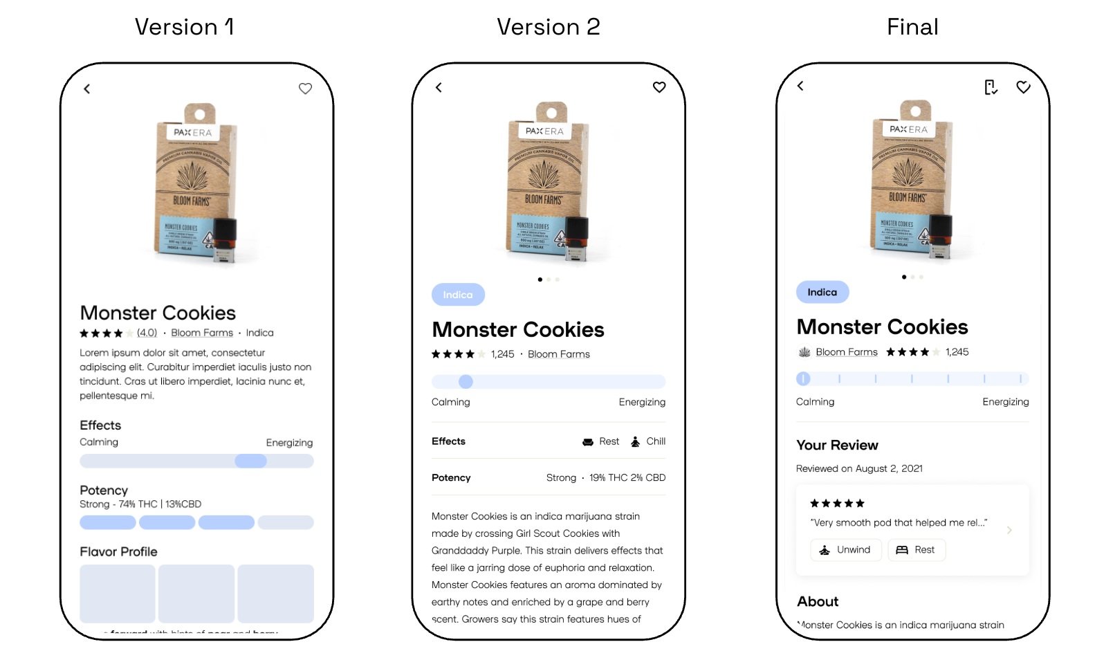
1. Discovery → 2. Smart-Match → 3. Booking → 4. ReflectionStrain Details Page Iterations
Version 1: Information feels dense at the top of the page. Visual hierarchy is flat between sections. Reviews should show # of reviewers. Effects slider is helpful but not very granular.
Version 2: Introduced an “Indica” badge, segmented ticks on the slider, icon-based effects row with specific effects, and moved descriptive text down—context improved but the page still felt cluttered.
Final: Complemented the slider with three clear effect chips + user-verified percentages. Well balanced visually. Information density is good (comprehensive but not overwhelming).
Results:
30% faster page scanning
User feedback: Clean, honest, scannable.
Release and Outcomes
Release Phases:
Phase 1 (MVP): Ratings, reviews, strain pages, Certificates of Analysis.
Phase 2 (Full): Quiz flow, Pods home/search, Brand Partner data.
Measurable Results:
42% adoption (4,200/10,000 MAUs) in initial six weeks
4.2★ Play Store rating (↑0.3★)
6 min avg. session duration
Legacy Platform & Visual Overhaul
When I joined, Sounding Board’s web app still looked like a utilitarian 2018-era admin panel—dense lists, minimal hierarchy, and low-contrast text that undermined user confidence.
I led a comprehensive visual redesign to match our emerging AI features and elevate trust:
Card-based layouts for clearer task & session grouping
Refined typography scale (24 px headlines → 14 px body) for better scanability
Elevated, WCAG AA-compliant palette aligned to brand blues & accent greens
Consistent iconography & 48 px grid spacing to give elements room to breathe


Goals
Increase coaching bookings: Lift sessions per user by ≥25%
Reduce admin setup time: Cut cohort creation from ~60 min to ≤45 min
Boost adoption: Achieve ≥50% activation among invited coachees in first 30 days
Surface ROI: Give stakeholders real-time visibility into investment returns
My Role & Scope
End-to-end ownership of UX/UI for five personas (Coachee, Coach, Admin, Manager, Stakeholder)
Ran 9 cross-functional design sprints with Data Science to define match-logic variables
Designed flows, wireframes, hi-fi mocks, prototypes, and handoff specs
Embedded analytics hooks in the UI in collaboration with the Analytics team
Design Strategy
User-Centered Flows
– Map end-to-end journeys for each persona to pinpoint key friction points
– Prioritize high-impact “moments of truth” (coach discovery, cohort setup, ROI reporting)Data-Driven AI Integration
– Define coach-matching algorithms and cohort-grouping logic with Data Science
– Surface match rationale and group stats to build trustVisual System & UI Modernization
– Build a scalable design language (spacing, type, color, icons) to modernize the interface
– Frame new features within a cohesive, confidence-inspiring visual systemIterative Prototyping & Validation
– Rapid wireframe → hi-fi → prototype cycles for guerrilla user tests
– Embed analytics hooks to measure task success, time-on-task, and error ratesCraft & Delight
– Surface micro-interactions (e.g., 200 ms card flips, 100 ms drag-and-drop snaps) for polish
– Ensure accessibility (≥44 px tap targets, WCAG AA contrast)
Key Components of the Platform
Coach Dashboard & Prep Toolkit
Persona: Coach
Functionality:
Active Client Roster: At-a-glance session list with status badges
Session Prep Panel: Quick access to client goals, past notes, resources
Post-Session Follow-Up: Reflection requests and feedback collection
Key Flow:
Dashboard → Session Prep → Delivery → Follow-UpAdmin Setup & Cohort Configuration
Persona: Corey (Admin)
Functionality:
Guided Setup Assistant: Step-by-step program creation wizard
AI-Suggested Grouping: Automatic cohort recommendations based on attributes
Scheduling & Notifications: Bulk session calendar and reminder automation
Key Flow:
Setup Assistant → Group Generation → Scheduling
Manager Oversight & Engagement Monitoring
Persona: Etta (Manager)
Functionality:
Team Roster & Surveys: Pending surveys and progress flags
Engagement Analytics: Adoption trends, high-potential highlights
Next Steps Recommendations: In-line CTAs for tailored development paths
Key Flow:
User Management → Program Monitoring → Alerts & Recommendations
Stakeholder Insights & ROI Reporting
Persona: Mia (Executive Sponsor)
Functionality:
Executive Dashboard: Overview of engagement, capability growth, and ROI
KPI Drill-Down: Interactive charts to explore program effectiveness
Report Export: One-click PDF/CSV downloads for stakeholder presentations
Key Flow:
Dashboard Overview → KPI Drill-Down → Export Reports